Beyond Scattered Data

Custom analytics dashboards are centralized, visual interfaces that consolidate data from multiple sources into a single, custom view, enabling you to track the metrics that matter most to your business and make faster, more informed decisions.
Key Elements of Effective Custom Analytics Dashboards:
- Centralized Data: Pull information from Google Analytics, CRMs, social media, and other platforms into one location
- Customized Metrics: Display only the KPIs aligned with your specific business goals
- Visual Clarity: Use charts, tables, and widgets to make complex data instantly understandable
- Real-Time Insights: Monitor performance as it happens, not days or weeks later
- Automated Reporting: Save time by eliminating manual data compilation
If you're a business leader with a good product and team, you've likely experienced the frustration of scattered data. Your team spends hours pulling reports from different platforms. Marketing teams typically spend 27% of their time on manual reporting—time that could be spent on strategy and execution. Without a centralized view, it's nearly impossible to see which efforts are driving results and which are wasting budget.
The reality is simple: data without context doesn't scale. Custom analytics dashboards transform raw data into actionable insights by organizing everything in one place, cutting through the noise, and showing you exactly what's working.
I'm Jose Escalera, CEO of The Idea Farm by VM Digital, and I've spent my career building companies and aligning sales, strategy, and marketing systems that produce measurable outcomes. Custom analytics dashboards are essential tools I use to help clients move from guesswork to clarity, turning their data into their greatest competitive advantage.
 flowing through an integration layer, then into a custom dashboard displaying key metrics like conversion rate, ROI, customer journey, and channel performance, with arrows pointing to actionable business decisions - custom analytics dashboards infographic")
What Are Custom Analytics Dashboards and Why Do You Need Them?
Imagine trying to steer a dense forest using a dozen different maps, each showing only a small, disconnected section. Frustrating, right? That is what standard reporting can feel like. Now, picture a single, comprehensive map, custom-drawn to your exact journey, highlighting every path, obstacle, and landmark relevant to your destination. That is the power of a custom analytics dashboard.

Defining the Dashboard
At its heart, a custom analytics dashboard is a dynamic, visual display of your most important business data. It is a key component of business intelligence (BI), designed to provide a quick, at-a-glance overview of your performance. We use these dashboards to centralize reporting, consolidate data from various sources, and monitor key performance indicators (KPIs) in real-time or near real-time.
Think of it as your single source of truth, where all critical information converges to paint a clear picture of your operational health and marketing effectiveness. For leaders focused on growth, these dashboards are not just about data visualization; they are about changing raw numbers into strategic insights.
Standard vs. Custom Dashboards
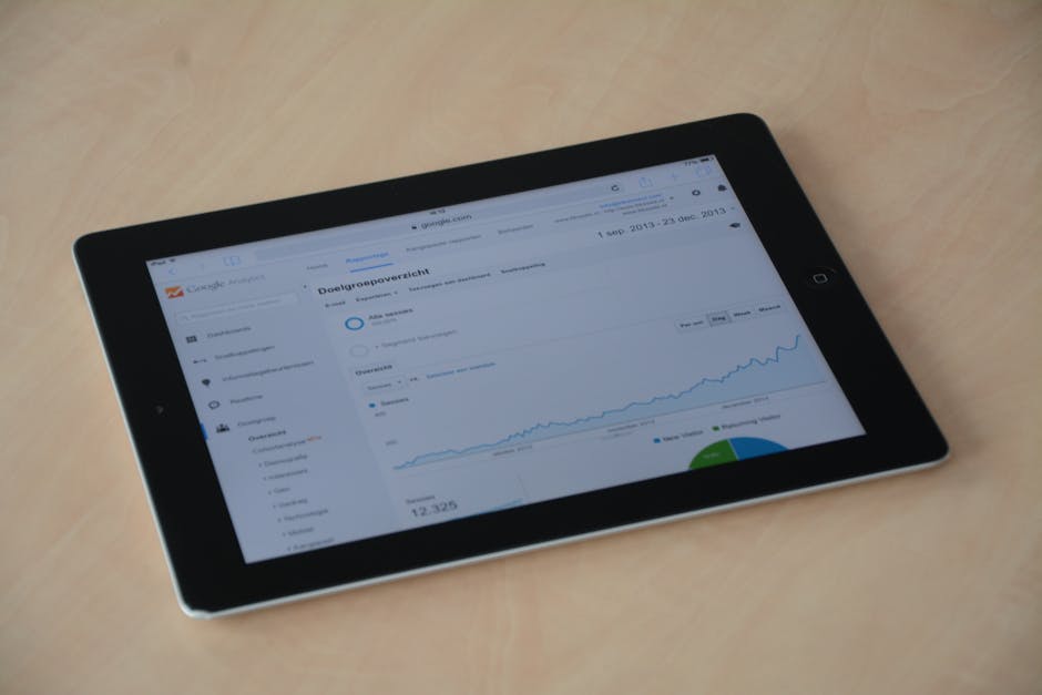
The distinction between standard and custom analytics dashboards is crucial. Standard dashboards, often found natively within platforms like Google Analytics, come with pre-built templates. They offer a general overview, but their one-size-fits-all approach means they often lack the specificity needed for unique business goals. They might show you basic website traffic, but they will not tell you how that traffic translates specifically into your unique sales funnel stages or how it correlates with your CRM data.
Custom dashboards, on the other hand, are built from the ground up to reflect your unique requirements and strategic objectives. This customization gives us total control over what we see and how we see it. We can choose specific metrics, combine data from disparate sources, and design the layout to highlight what truly matters to your business in Houston, TX, or Danville, KY. This custom approach allows us to go beyond generic data and deliver actionable insights directly relevant to your growth strategy.
The Core Benefits for Your Business
Investing in custom analytics dashboards is not just about looking fancy; it is about gaining a strategic edge. Here are the core benefits we see our clients realize:
- Customization: As mentioned, this is the superpower. We select precisely the metrics and dimensions that align with your business goals, ensuring every piece of data serves a purpose. This custom approach allows us to address specific questions about your market, operations, and customer behavior.
- Centralization: Imagine all your marketing and sales data - from Google Analytics to your CRM, social media platforms, and advertising campaigns - living in one place. This provides maximum visibility into the most actionable metrics in a centralized location, giving you a holistic view of performance.
- Transparency: No more digging through endless spreadsheets or waiting for weekly reports. A Google Analytics Dashboard offers transparency and accessible insights at any given time. This clarity helps prevent miscommunication, reduces delays, and keeps everyone on the same page, fostering a truly data-driven culture.
- Cross-Channel Insights: In today's complex digital landscape, customers interact with your brand across multiple touchpoints. Google Analytics allows us to pull information from different marketing channels and compare them, helping us understand the synergistic effects of your efforts and optimize your marketing mix.
- Funnel Visibility: Understanding your customer's journey is paramount. Using Google Analytics allows us to see into each stage of your funnel and find where the holes are. This visibility helps identify bottlenecks, optimize conversion paths, and improve the overall customer experience.
- ROI Tracking: Every marketing and sales effort must contribute to your bottom line. Custom dashboards are designed to directly visualize results, allowing you to answer critical questions about return on investment quickly and confidently. This empowers leaders to make strategic decisions about resource allocation.
- Marketing and Sales Alignment: When both marketing and sales teams share a common view of real-time data, it fosters alignment. Dashboards can help bridge the gap between these departments, ensuring everyone is working towards the same goals with a unified understanding of performance.
The Blueprint: Building High-Impact Custom Analytics Dashboards
Building a custom analytics dashboard is like constructing a precision instrument for your business. It requires careful planning and execution, but the payoff in clarity and actionable insights is immense.

Step 1: Choosing Your Essential Metrics (KPIs)
The foundation of any effective dashboard lies in selecting the right metrics. These are not just any numbers; they are your Key Performance Indicators (KPIs), the vital signs of your business. For leaders focused on growth, these metrics must directly reflect your strategic objectives. Here are some essential metrics we often include:
- Impressions: The number of times your content or ad was displayed. This helps us understand your reach and brand visibility.
- Clicks: The number of times users interacted with your content or ad. This indicates engagement and interest.
- Conversion Rate: The percentage of users who completed a desired action (for example a purchase or a lead form submission). This is a critical measure of effectiveness.
- Cost per thousand (CPM): For paid campaigns, this metric tells us the cost of 1,000 impressions, helping us gauge ad efficiency.
- Top Keywords: For organic and paid search, these reveal what users are searching for to find you, informing content and ad strategy.
- User Engagement: Metrics like bounce rate, pages per session, and average session duration tell us how users interact with your website.
- Revenue: The ultimate bottom-line metric, often broken down by channel, product, or customer segment.
Choosing these metrics wisely ensures your dashboard provides a clear, concise answer to the question: "Are we achieving our goals?"
Once we have identified your key metrics, the next step is to present them in a way that is easy to understand and act upon. This is where visualizations and widgets come in. Dashboards contain one or more widgets (up to 12 per dashboard in some platforms) that give you an overview of the dimensions and metrics you care about most. Custom dashboards support a variety of widget types, so we can choose the best way to display your data.
Here are common types and when to use them:
- Metric Widgets: Simple numeric representations of a single value (for example "Total Conversions: 1,234"). Ideal for quick snapshots of critical numbers.
- Timeline (Line) Charts: Show trends over time (for example website traffic over the past month). Excellent for identifying patterns and changes.
- Bar Charts: Compare discrete categories (for example conversions by marketing channel). Great for side-by-side comparisons.
- Pie Charts: Display parts of a whole (for example traffic sources by percentage). Use sparingly and for a small number of categories.
- Geo Maps: Visualize data geographically (for example website visitors by city or state). Useful for understanding regional performance.
- Data Tables: Present raw numbers in an organized, row-and-column format. Good for detailed breakdowns and when specific numerical values are important.
- Scorecards or Gauges: Display a single metric against a target or threshold, often with color coding to indicate performance status.
We also distinguish between standard and real-time widgets. Standard widgets display processed data, typically updated daily. Real-time widgets, on the other hand, update their metrics automatically for active website users, showing live data like current active users or pageviews. These are very useful for monitoring immediate impact, such as after launching a new campaign.
For advanced customization of charts and their options, we can refer to comprehensive documentation like the ECharts documentation.
The effectiveness of a custom analytics dashboard depends on its ability to pull data from everywhere it lives. We build connected, data-driven marketing systems custom to your numbers and goals, ensuring consistent, scalable growth. This often involves integrating data from various platforms using different methods:
- ETL (Extract, Transform, Load) Solutions: These systems automate the process of pulling data from multiple sources, cleaning and changing it, and then loading it into a data warehouse or directly into a dashboarding tool. This is crucial for handling complex data sets and ensuring data quality.
- APIs (Application Programming Interfaces): Many platforms offer APIs that allow for direct, programmatic data extraction. This provides flexibility and often enables real-time or near real-time data flows.
- Native Connectors: Many dashboarding platforms have built-in connectors for popular data sources.
Common tools and data sources we work with include:
- Google Analytics (GA4): Essential for website and app performance, user behavior, and conversion tracking.
- Looker Studio (formerly Google Data Studio): A powerful, free tool for creating custom dashboards with data from various Google sources and other connectors.
- Power BI: A business intelligence tool from Microsoft, useful for complex data modeling and enterprise-level reporting.
- CRM Data: Integrating customer relationship management data (for example from Salesforce or HubSpot) provides insights into sales pipeline, customer lifetime value, and lead quality.
- Social Media Data: Data from platforms like Facebook, Instagram, LinkedIn, and X (formerly Twitter) helps us understand audience engagement, brand sentiment, and campaign performance.
The goal is to create a seamless flow of information so your dashboard is always up-to-date and comprehensive. For more in-depth insights into the systems that power your online presence, you can find More info about website systems on our site.
Step 4: A Step-by-Step Guide to Creating Your First Dashboard
If you are ready to build your first custom analytics dashboard, here is a generalized approach. The specific steps will vary slightly depending on the tool you choose (for example Google Analytics, Looker Studio, Power BI, or a custom solution built by us):
- Define Your Objectives: Decide what questions you need this dashboard to answer and what key decisions it will inform. For instance, are you tracking campaign ROI, website performance, or sales pipeline health?
- Identify Your Data Sources: List all the platforms where the data needed to answer your objectives resides (for example Google Analytics, your CRM, advertising platforms, email marketing software).
- Select Metrics and Visualizations: Based on your objectives, choose the specific KPIs and the best widget types to display them effectively. Less is often more, so focus on impact.
Choose Your Dashboarding Tool: Select a platform that aligns with your data sources, technical capabilities, and budget. For reference, Google Analytics (Universal Analytics) offered a straightforward way to create dashboards:
- Sign in to Google Analytics.
- Steer to your view.
- Open Reports.
- Click CUSTOMIZATION > Dashboards.
- Click Create.
- Select either Blank Canvas (to start from scratch) or Starter Dashboard (to use a default set of widgets). You can also import dashboard configurations from the Solutions Gallery.
- Give your dashboard a descriptive title and click Create Dashboard.
- Click "+ Add Widget" to open the widget editor.
- Select the widget type (Metric, Timeline, Geomap, Table, Pie, Bar).
- Configure its dimensions, metrics, and options. Optionally, add a filter or link it to a report or URL.
- Enter a widget title and click Save.
You can find detailed legacy instructions on Create and customize Dashboards. While Universal Analytics has been replaced by GA4, the fundamental principles of dashboard creation remain.
- Design the Layout: Arrange your widgets logically. Group related metrics, use clear headings, and ensure a visual hierarchy that guides the viewer's eye to the most important information first.
- Add Filters and Segments: Implement dashboard-wide filters or segments to allow users to drill down into specific data, such as a particular date range, traffic source, or customer segment.
- Share and Iterate: Share your dashboard with stakeholders and gather feedback. Dashboards are living documents; they should evolve as your business needs change. Monitor usage, identify pain points, and refine the dashboard for optimal usability and insight.
Building a custom analytics dashboard is a significant step, but mastering it involves ongoing refinement and strategic application. It is about ensuring your dashboard does not just display data, but actively drives smarter decisions.
Best Practices for Dashboard Design and Usability
An effective dashboard is more than just a collection of charts; it is a story told through data. Here are our best practices for design and usability:
- Audience-First Approach: Always design with your end-user in mind. A CEO needs high-level KPIs, while a marketing manager might need granular campaign data. Tailor the content and complexity to the specific audience.
- Logical Grouping: Arrange related metrics and visualizations together. This creates a natural flow and makes the dashboard easier to understand. Think about how you tell a story with your data.
- Visual Hierarchy: Use size, color, and placement to emphasize the most important information. Your eye should naturally be drawn to the key takeaways.
- Minimalist Design: Avoid clutter. Every element on the dashboard should serve a purpose. Too much information can overwhelm and obscure insights. Custom dashboards let you display information that is of interest to you, organized in a way that is useful to you.
- Context Is Key: Provide context for your numbers. Are these figures good or bad? How do they compare to previous periods or benchmarks? Use clear labels, titles, and where helpful, brief annotations.
- Dashboard Organization: Use dashboard-wide filters which apply to all widgets on the dashboard. This allows users to quickly segment data (for example by date range or marketing channel) without recreating the dashboard. Variables can also be used to apply to selected widgets, offering more granular control.
Automating Reports to Maximize Efficiency
One of the greatest advantages of custom dashboards is the opportunity to automate reporting, freeing up valuable time and resources. Marketing teams typically spend 27% of their time on manual reporting, which is a significant drain on productivity.
Automated reporting transforms this challenge into an opportunity:
- Time-Saving: Once set up, automated reports gather and display data without manual intervention. This means less time spent on data compilation and more time focused on analysis and strategy.
- Reduced Manual Errors: Human error is common in manual data entry and manipulation. Automation reduces this risk, helping ensure data accuracy and consistency.
- Real-Time or Scheduled Refresh: Many automated dashboards can be configured to refresh data at regular intervals, providing near real-time insights without constant manual updates.
- Consistent Delivery: Automated reports can be scheduled for regular delivery to stakeholders, ensuring everyone receives timely and consistent information.
- Focus on Strategy: By taking the repetitive work out of reporting, your team can dedicate more effort to understanding the "why" behind the data and developing impactful strategies.
This shift allows you to move from simply reporting activity to truly understanding results and optimizing your digital ads strategy. For more strategies on maximizing your ad spend and understanding performance, explore More info about digital ads.
Ensuring Data Accuracy, Access, and Collaboration
The integrity of your custom analytics dashboards relies heavily on data accuracy and consistency. Without trust in the data, decisions become guesses.
- Data Accuracy and Consistency: We implement validation processes and automated data cleaning to help keep the information flowing into your dashboards reliable. Standardized naming conventions across all data sources are important for consistent reporting. Regular reviews and cross-referencing data against source systems help maintain quality.
- User Permissions and Admin Privileges: Not everyone needs access to every piece of data. We configure user permissions so that individuals and teams have access to the data relevant to their roles, protecting sensitive information while empowering decision-makers. Admin privileges are reserved for creating, modifying, and managing dashboards.
- Fostering a Data-Driven Culture: Custom dashboards are useful tools for collaboration. By providing a shared, transparent view of performance, they encourage cross-functional teams to engage with data, ask questions, and take part in data-driven decision-making. When everyone understands the metrics and their impact, it leads to more informed discussions and aligned actions.
- Troubleshooting Common Issues: Even with a well-designed setup, challenges can arise. Common issues include data discrepancies, broken integrations, or slow-loading dashboards. A structured approach to troubleshooting, including checking data sources, integration points, and dashboard configurations, helps resolve these issues efficiently. Clear documentation and a defined support process are also helpful.
For leaders looking to embed this data-driven mindset throughout their organization, our fractional CMO services can provide the strategic leadership to guide this change. Learn more about how we can help with More info about fractional CMO services.
Frequently Asked Questions about Custom Analytics Dashboards
We are often asked about the practical applications and future of custom analytics dashboards. Here are some common questions and our insights.
What industries benefit most from custom analytics dashboards?
While virtually every business can benefit from custom dashboards, certain industries find them particularly useful due to their reliance on complex data and rapid decision-making:
- eCommerce: Tracking sales funnels, customer behavior, product performance, and marketing campaign ROI is central for online retailers. Custom dashboards provide a consolidated view of these diverse data points.
- Healthcare: Monitoring patient outcomes, operational efficiency, resource allocation, and regulatory compliance requires precise, timely data visualization.
- Finance: Managing investments, tracking market trends, assessing risk, and monitoring financial performance benefits from dashboards that consolidate large amounts of financial data.
- Education: From student performance analytics to enrollment trends and resource utilization, custom dashboards help educational institutions make data-driven decisions.
- SaaS (Software as a Service): Metrics like customer acquisition cost (CAC), customer lifetime value (LTV), churn rate, and user engagement are vital for SaaS companies. Custom dashboards bring these together for a holistic view of business health.
Any industry where data-driven decision-making is important can gain value from these custom insights.
How do you ensure data is accurate in a custom dashboard?
Data accuracy is essential. If you cannot trust the data, you cannot trust the decisions made from it. We support data accuracy through several practices:
- Data Validation at Source: Applying checks at the point of data entry or collection helps minimize errors from the start.
- Automated Data Cleaning: Using scripts and tools to identify and correct inconsistencies, duplicate entries, or formatting issues before data enters the dashboard.
- Standardized Naming Conventions: Using consistent naming across all marketing campaigns, channels, and data points. This is particularly important when integrating data from multiple platforms.
- Regular Audits and Reconciliation: Periodically cross-referencing dashboard data against the original source systems to detect discrepancies.
- Clear Data Definitions: Establishing and communicating clear definitions for every metric and dimension used, so everyone interprets the data the same way.
These steps help maintain the integrity and usefulness of your dashboards.
What are the future trends in custom analytics dashboards?
The world of data analytics is constantly evolving, and custom analytics dashboards are no exception. Several trends are especially important:
- AI-Driven Insights and Natural Language Queries: Increasingly, AI and machine learning can analyze data, identify anomalies, and suggest insights automatically. Natural language processing (NLP) makes dashboards more accessible by allowing users to query data using plain language questions.
- Predictive Analytics: Moving beyond "what happened" to "what is likely to happen next". Dashboards are incorporating more predictive models, offering forecasts and highlighting potential future trends.
- Improved Real-Time Capabilities: As real-time data processing improves, dashboards can provide more instantaneous views of performance from a wider range of sources.
- Deeper Integration Across Ecosystems: Dashboards are becoming more tightly integrated with operational systems (for example CRM, ERP, marketing automation), allowing for closed-loop analytics where insights can directly trigger actions.
- Greater Interactivity and Personalization: Dashboards are offering more flexibility for users to customize their views, drill down into data, and personalize the information presented based on their roles and interests.
These developments will continue to make custom analytics dashboards more powerful, intuitive, and central to strategic business operations.
Turn Your Data into Your Greatest Asset
From the frustration of scattered data to the clarity of actionable insights, custom analytics dashboards are a game-changer for any business leader focused on growth. They centralize your most critical information, tailor it to your unique objectives, and transform raw numbers into a compelling narrative of your business performance.
We’ve seen how these dashboards move businesses beyond basic reporting, providing the transparency, cross-channel insights, and funnel visibility needed to make truly data-driven decisions. By choosing the right metrics, leveraging appropriate visualizations, and integrating data seamlessly, you can create a powerful tool that not only monitors your progress but actively informs your strategy.
At The Idea Farm by VM Digital, we specialize in building these connected, data-driven marketing systems. We understand that tactics without context don’t scale. That’s why we focus on strategy, systems, measurement, and growth—because you're responsible for results, not just activity. Let us help you open up the full potential of your data, ensuring consistent, scalable growth for your business in Houston, TX, or Danville, KY.
Ready to gain unparalleled clarity and drive your business forward with confidence?
Build your Growth Dashboard